Liquidation Heatmaps — How to Read Liquidity Magnets and the Liquidation Map
Published 2026.07.06
You've probably seen a liquidation heatmap with a long yellow band stretching across it, and heard someone explain that "price gets sucked toward that level." Price moving toward the bright bands is indeed a frequently observed pattern — but if you don't know what the map is calculating and how, the colors are just a picture. This guide walks through what the heatmap actually displays (estimated liquidation-price density, not real orders), the mechanics behind the magnet effect, and a reading procedure for tracking how bands form, fade, and get consumed. It also refuses to hide the tool's fatal limitation — everything on it is an estimate — and covers how to cross-check those estimates against real, observable data.
- A liquidation heatmap is not a map of real resting orders. It's a color-coded map of 'estimated liquidation-price density,' reverse-engineered from open interest changes and leverage assumptions. The brighter a zone, the more positions are estimated to share a liquidation price there.
- The logic behind the magnet effect is simple — liquidations are forced market orders that cannot be canceled, so clusters of liquidation prices are the most reliable liquidity candidates for filling large size.
- The core of heatmap reading isn't picking the right band — it's tracking bands over time: formation (new entries), fading (voluntary unwinds), and consumption (price punching through and liquidations firing).
- The heatmap is an estimate shaped by exchange coverage and leverage assumptions, and the self-fulfilling-prophecy debate is real. Its reliability changes when cross-checked against measured data — like Hyperliquid, where liquidation prices are publicly visible on-chain.
What a Liquidation Heatmap Is — an Estimated Map of Forced Orders
A liquidation heatmap is a map that paints, across a price-by-time plane, the estimated density of positions that would be force-liquidated if price reached each level. The brighter and thicker a horizontal band, the more positions are estimated to have their liquidation prices stacked at that level. Get the first premise exactly right — the bands on a heatmap are not real orders sitting in the order book. A liquidation order is created by the exchange's engine only at the instant price touches the liquidation level; before it triggers, it exists nowhere. The heatmap is a calculated guess about where those 'orders that don't yet exist' will be born.
The math varies by tool, but the skeleton is the same. Exchanges don't publish individual positions' liquidation prices, so the tool first infers from open interest (OI) increases and traded volume that 'a large batch of new positions entered around this price.' It then assumes representative leverage multiples (typically 10x, 25x, 50x) and reverse-engineers the liquidation prices. A liquidation price sits roughly 1/N of the way from entry, where N is the leverage multiple — slightly closer, in fact, because of maintenance margin — so if longs piled into BTC at $100,000, the 10x liquidation band is drawn just above $90,000, the 25x band near $96,000, and the 50x band near $98,000. That's why a single entry cluster splits into several layered bands depending on the leverage assumption.
What it shows — an estimated density of where forced-order 'candidates' may have accumulated at each price level. What it can't show — the actual liquidation price of any individual position, positions whose liquidation price moved after margin was added, or the volume on exchanges excluded from the calculation. That gap is the root of every limitation covered later. If the liquidation mechanism itself is unfamiliar, read What Is Liquidation first.
The Magnet Effect — Price Goes Where the Liquidity Is
Why is price so often observed moving toward the bright bands? To fill large size, big money needs matching orders on the other side. Ordinary limit orders can be canceled at any moment, but a liquidation is a forced market order that cannot be canceled. The moment price touches the band, that volume must hit the market — which makes liquidation clusters the most dependable axis of liquidity that exists in the market. For anyone who needs to move serious size, that zone is close to the only spot where a fill is guaranteed.
That's why traders read the heatmap's bright bands not as targets but as fuel. When a thick long-liquidation band sits below price, punching through it unleashes forced selling that accelerates the drop; when short-liquidation bands are stacked above, a breach triggers forced buying that accelerates the rally. It's the exact same phenomenon behind the stop hunt — a quick jab past a prior extreme followed by a reversal — and behind SMC, which infers liquidity locations from chart structure. The difference is that the heatmap visualizes it as calculated density.
A bright band on the heatmap isn't price's destination — it's where the fuel is stacked, waiting to burn as price passes through.
The Reading Procedure — Watch Bands Form and Disappear
The classic beginner mistake is to take a snapshot, pick the single brightest band, and declare 'price is going there.' The heatmap is not a snapshot — it's a tool you read as a moving picture. When did the band form? Does it fade before price ever touches it? Do liquidations actually fire when it's breached? That time dimension carries most of the information. Below is that observation procedure, organized for study purposes.
- Keep two timeframes open — a 12-hour-to-1-day heatmap for the micro bands, and a 1-week-to-1-month heatmap for the bigger battlefield. A band that looks bright on the short timeframe can be background noise on the long one.
- Check when each band was formed — a band that appeared right after a sharp pump or dump is the footprint of freshly opened positions, so it's more likely to be live liquidity. A band formed long ago may already have been unwound.
- Track fading — if a band dims or vanishes without price ever touching it, those positions were closed voluntarily (stops, take profits, or added margin). Where the magnet has dissolved, there is no magnet anymore.
- Verify consumption — the moment price punches through a band, check whether real liquidations actually cluster on the live liquidation feed. If the band was bright but the liquidations stayed quiet, the estimate was wrong.
- Measure the asymmetry above and below — compare total liquidity above the current price (short liquidations) versus below (long liquidations), and cross-reference with funding rates and OI skew. If one side is overwhelmingly thicker, that side is the more attractive fuel depot.
- Define your invalidation in advance — if the scenario is watching for a reversal after a band is consumed, decide before you start observing exactly where you'll admit you're wrong, e.g. 'if price fails to reclaim the far side of the band after consumption, the scenario is dead.'
Bands also provide coordinates for the risk-reward structure. Say BTC trades at $100,000 with a thick long-liquidation band below at $97,200. A trader watching for a reversal after that band is consumed might anchor on roughly $97,800 — where the post-sweep reclaim gets confirmed — with invalidation below the band's lower edge at $96,900, a risk distance of about 0.9%. If the target structure is a reclaim of the prior high at $101,400, that's roughly 3.7% away — a skeleton of about 1:4 risk-reward. The point is never to 'call' the band, but to let the band set the coordinates for invalidation and target; converting those numbers into an affordable dollar loss belongs to liquidation prevention and risk management.
The Link to Liquidation Cascades — When Bands Collapse
The heatmap's most dramatic validation comes when bands collapse in sequence. When price punches through the first long-liquidation band, that volume converts into forced market selling that pushes price lower still — and the lower price triggers the next band beneath it. The more tightly the bands stack like stairs on the heatmap, the shorter the gaps between dominoes; this chain is the structure of the liquidation cascade that can erase several percent in minutes. The same holds in reverse — a chain breach of short-liquidation bands overhead becomes the accelerant of a short squeeze.
The most dangerous misreading of a heatmap is treating a thick band as a 'floor.' A band is not a buy wall — it's the opposite: volume that converts into forced selling the instant price touches it. It's less a floor than a sinkhole rigged to collapse. And if you're holding a leveraged position whose own liquidation price sits inside a bright band, your account is literally counted as one of the dominoes in the chain. Since the potential for loss is built into the structure at that spot, moving your own liquidation price out of the dense zones is the single most practical conclusion a heatmap can give you.
The Limits — the Heatmap Is an Estimate
Now let's look honestly at the tool's foundation. A heatmap stands on at least four layers of estimation. First, the entry-zone estimate — reverse-engineering entry clusters from OI changes is itself an approximation. Second, the leverage assumption — the actual distribution of leverage across positions is unknowable, so a handful of representative multiples are assumed, and a different assumption shifts the bands wholesale. Third, coverage — only some exchanges feed the calculation, and volume outside them simply isn't on the map. Fourth, stale updates — liquidation prices that moved due to added margin or partial closes are reflected late or not at all. A bright band may in fact be a ghost that's already gone.
The deeper problem is the self-fulfilling-prophecy debate. If thousands of traders look at the same heatmap and bet toward the same band, there's no way to tell whether price moved there because of the forced-order mechanics or because of the audience's collective behavior. Verification is hard too — in hindsight, the bands that worked are always remembered and the ones that didn't are quietly forgotten. 'Big bands always get filled eventually' is unfalsifiable unless you specify a time horizon, which puts the after-the-fact curve-fitting critique in the same family as the one leveled at SMC. Nor is there any independently verified track record of long-term performance built on this tool.
1) A band is not a price target — big bands frequently dissolve without ever being touched. 2) If band locations differ across tools, that's a difference in calculation assumptions, not in the market. 3) In the sentence 'there's a band, so price will go there,' the only evidence is one estimated density — never forget that. The heatmap is an ingredient for scenarios, not a conclusion, and the habit of picking direction from it alone is betting your account on an estimate.
Whale Story's Measured Data — Real Liquidation Prices, Not Estimates
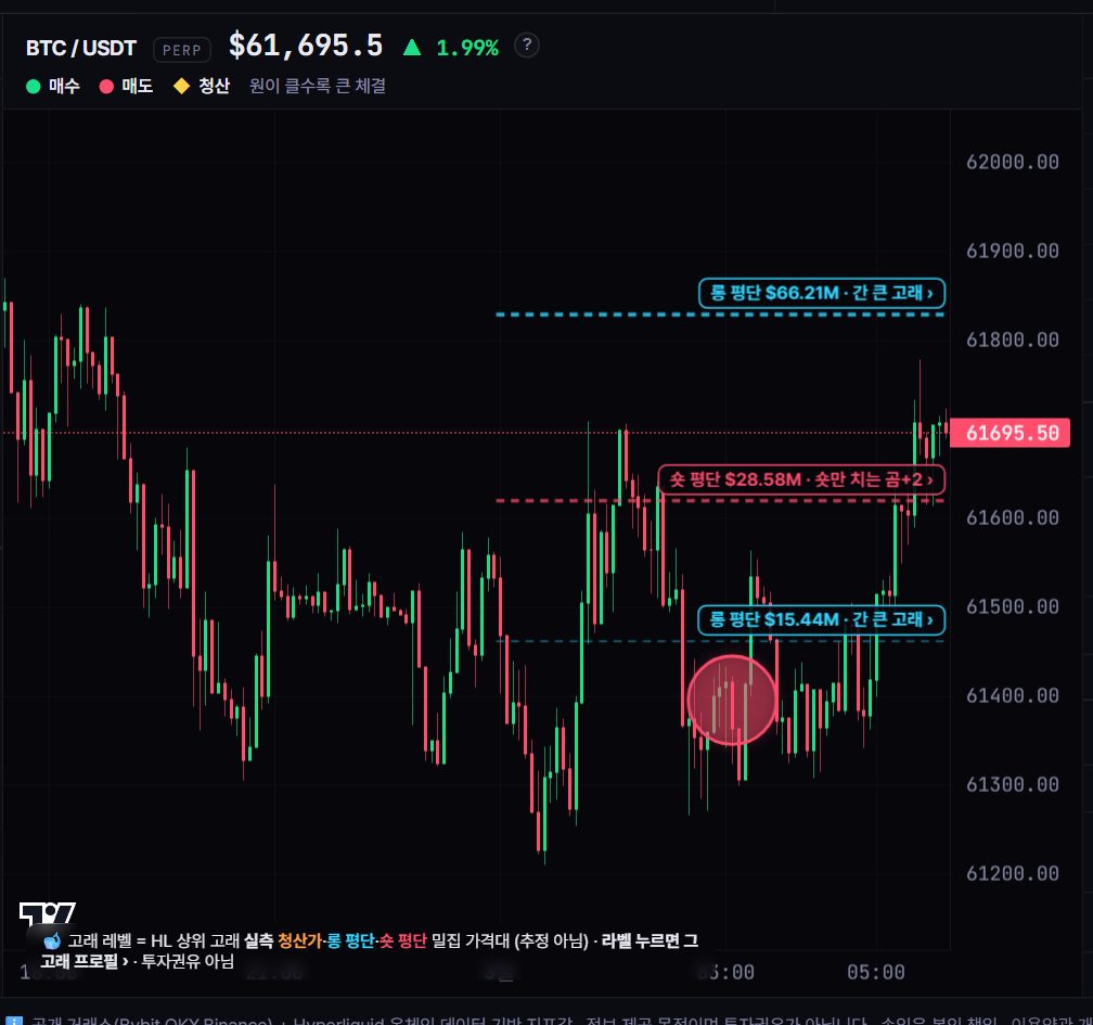
There is one way to close the estimation gap — watch a market where liquidation prices are publicly visible. On Hyperliquid, positions are recorded on-chain, so the average entries and liquidation prices of the top whales can be looked up as measured facts, not estimates. The Whale Levels overlay in Whale Story's live tracker plots these real liquidation prices and entries directly on the chart. Unlike a heatmap band painted where positions 'should be,' the liquidation prices shown here are the coordinates of positions that exist right now.
So the practical use is not replacement but cross-checking. When a bright heatmap band and measured whale liquidation prices overlap at the same level, the liquidity estimate for that zone gains credibility; when the heatmap glows but the measured levels are empty, suspect that the band is an artifact of the assumptions. In fact, the cases of large whales whose liquidation prices were publicly tracked and who were repeatedly liquidated showed that a visible liquidation price can become a target for every market participant watching — the principle of using whale data for observing levels and crowding rather than copying direction is covered in The Whale's Playbook.
1) Mark the major heatmap bands above and below the current price → 2) Check the Whale Levels overlay for whether measured liquidation prices actually cluster near those zones → 3) As price approaches, record whether liquidations fire on the live feed or price passes through quietly. All three steps are observation, not prediction — and the accumulated log becomes your own personal dataset on how much to trust the heatmap.
The liquidation map that heatmaps can only estimate can be checked against measured data on Whale Story. The Whale Levels overlay in the live tracker plots the actual liquidation prices and average entries of top Hyperliquid whales on the chart, and in past observations, when price punched through levels where measured liquidation prices were stacked in layers, forced fills repeatedly clustered on the live liquidation feed and long wicks were left behind. Right after chains of short-liquidation zones overhead were consumed during sharp rallies, suspected-top signals have been observed lighting up at the same time, and exchange inflows and outflows from smart-money wallets have also been recorded moving around liquidation cascades. These are tendencies in past data only, however — they guarantee neither that any particular band will be reached nor that a reversal will follow.
FAQ
Are the bright bands on a liquidation heatmap real orders?
No. A liquidation order is created only at the instant price touches the liquidation level, so before triggering it exists nowhere. Heatmap bands are 'estimated liquidation-price density' reverse-engineered from open interest changes and leverage assumptions — an estimate that can differ from the actual distribution of positions.
Does price always go to the brightest band?
No. Big bands frequently dissolve through position unwinds without ever being touched. The magnet effect is a tendency that follows from the structure — liquidation clusters are dependable liquidity candidates — not a law, and no tool can guarantee timing or whether a level will be reached at all.
How is a heatmap different from Whale Story's Whale Levels?
A heatmap is an estimated map calculated from assumed entries and leverage; Whale Levels shows the actual liquidation prices and average entries of top Hyperliquid whales, whose positions are publicly visible on-chain. Because they're different in kind, the sensible usage is cross-checking them together rather than substituting one for the other.
Isn't the heatmap's magnet effect just a self-fulfilling prophecy?
That debate genuinely exists. When many traders look at the same map and bet on the same band, it's hard to separate whether price moved there because of forced-order mechanics or collective behavior. That said, the underlying structure — liquidations are forced orders that cannot be canceled — is an observable fact, so the honest conclusion is that both factors are layered on top of each other.