How to Draw Support and Resistance — It's a Zone, Not a Line
Published 2026.07.06
When people search for support and resistance, the real question is "where exactly do I draw it, and how?" The reason every YouTube chart shows different lines isn't that no drawing rules exist — it's that most people draw without any. This guide starts with why support and resistance form in the first place, then lays out the procedure: the order to draw in, how to grade strength, and how a level's role flips when it breaks (the S/R flip). It also covers this tool's biggest weakness — draw lines anywhere and they all look right in hindsight — and a verification method unique to crypto futures: reading whale liquidation clusters as measured supply zones.
- Support and resistance aren't lines that know the future — they're a density map of resting orders and break-even psychology left behind by past fills. That's why they're better understood as supply and demand zones.
- Draw them as zones with width, not one-pixel lines. The span between the wick extremes and the candle-body boundary defines the zone's width — and that width becomes a direct input to your stop-distance math.
- Draw from the higher timeframe down. Keep only levels that reacted at least twice, weight recent reactions over old ones at equal touch counts, and cap yourself at 2–3 zones above and below the current price.
- Broken resistance tends to flip into support (the S/R flip). In crypto futures, one more layer stacks on top: liquidation clusters — supply zones you can actually measure.
Why Support and Resistance Exist — Memory, Resting Orders, Break-Even Psychology
A price area where declines repeatedly stall is support; one where rallies repeatedly get rejected is resistance. A given price area behaves this way not through chart magic but because of three kinds of residue. First, the record of heavy past fills at that price. Second, the resting orders already placed there on the strength of that record. Third, the break-even psychology of everyone who remembers that price. If the candles and volume guide taught you to read candles as a record of order fills, support and resistance are what that record looks like stacked along the price axis.
Break-even psychology works in a very concrete way. Holders who bought at $68,000 and got trapped become resting sell supply the moment price returns near their entry — "I'll sell as soon as I'm back to even." That's the mechanism by which a heavy past-fill area turns into resistance. Conversely, everyone who missed the buy at that price becomes resting demand — "if it comes back, I'm buying" — turning the same area into support. Layer on prior highs, prior lows, and round numbers that everyone references, and order density climbs further.
This is why support and resistance are best thought of as supply and demand zones: it means inventory that people want to sell (or buy) has accumulated at that price area. In other words, S/R analysis isn't prophecy — it's the work of mapping the price areas where orders and psychology cluster. The more accurate the map, the higher the odds of observing a reaction. The reaction itself is never guaranteed.
It's a Zone, Not a Line — How to Draw With Width
The classic beginner mistake is drawing support and resistance as one-pixel lines. Market orders don't cluster at one exact price. Some resting bids sit a little higher; some stops sit a little lower. That's why the actual bounce and rejection points differ slightly every time, and why wicks constantly stab through a line and snap back. Draw a line and your broke/held verdict gets whipsawed by that noise — and when the verdict wobbles, so does your stop.
Put numbers on it. If BTC halted three separate declines at $67,600, $68,200, and $67,800, the support isn't "the 68,000 line" — it's the 67,600–68,200 zone (roughly 0.9% wide). Drawn this way, the decision rule becomes clean: movement inside the zone is noise; a close below the zone's lower edge is a breakdown. A candle that wicks down to 67,500 and recovers isn't a breakdown at all — it's an observation that the zone was defended.
The default is to span the zone from the wick extremes to the body boundary (open/close) of the reaction candles. The higher the timeframe, the wider the zone. This width isn't decoration — it's an input to your math. Put your invalidation just outside the far edge of the zone, and the zone's width becomes the floor on your stop distance, and that stop distance sizes the position.
The Drawing Order — Higher Timeframes First, Strength by Touch Count and Recency
The order you draw in matters as much as where you draw. Start from lower timeframes and you end up with dozens of lines — and the more lines, the less useful the map. The order is always top-down.
- Start on the higher timeframe — On the daily (add the weekly for swing trades), mark only the levels that jump off the chart: prior highs, prior lows, the top and bottom of long consolidations. Three to five zones, no more.
- Count the reactions — Keep only zones that produced at least two reactions (a bounce or rejection). One stall could be coincidence. A zone with three or more reactions is a first-tier candidate.
- Weight recency — At equal touch counts, the more recent reaction wins. A level that reacted twice in the past two weeks may reflect today's order density better than one that reacted three times six months ago.
- Check volume — Look at whether the reaction candles carried volume. A bounce on heavy fills is a record that real buyers actually stood at that price.
- Refine edges on lower timeframes only — Drop to the 4-hour and 1-hour to fine-tune each zone's upper and lower boundaries. Resist, hard, the temptation to add new zones at this stage.
- Cap the count — Finish with only 2–3 zones above and 2–3 below the current price. Delete the rest. Distant zones only matter when price approaches them — redraw them then.
Draw a line at every wick and wiggle and price is "near support" wherever it goes. At that point support and resistance stop being an analytical tool and degrade into a device that justifies any action after the fact. Ten lines might as well be zero — half the craft of mapping is keeping only the lines you can't bring yourself to delete.
Role Reversal — Broken Resistance Becomes Support
The most useful property of support and resistance is that when a level breaks, its role flips (the S/R flip). The moment resistance is broken, the entire set of interests at that price area changes sides. Those who bought above the breakout price become resting bids on the pullback, defending their average entry. Those who missed the breakout become resting bids of their own — "if it revisits that level, I'm in." And those who shorted into that area place break-even exit covers (buys). Three kinds of resting demand pile into one zone, and yesterday's ceiling becomes today's floor. The same mechanics work symmetrically to the downside.
Walk through the structure with a teaching example. ETH's $3,380–3,420 resistance zone breaks on a close at $3,460, and the pullback then stalls near $3,420 — the top of the old resistance. That's the retest. The arithmetic traders run at this spot goes like this: reference price $3,430; invalidation is a fresh breakdown below the zone's lower edge ($3,380); with a buffer, the invalidation line sits at $3,360 (a distance of $70, roughly 2%); the distance to the prior swing high at $3,640 is $210. One unit of distance at risk against three units targeted — a 1:3 risk-reward structure, computed in advance. And if the pullback instead cuts through the zone and closes below $3,360, that becomes the point where you concede the breakout itself was false. This is exactly where a scenario with defined invalidation parts ways with one without.
The same price area that was a wall becomes a floor — the moment the market's memory switches sides.
On a Real Chart — How Zones Do Their Job, and How They Betray You
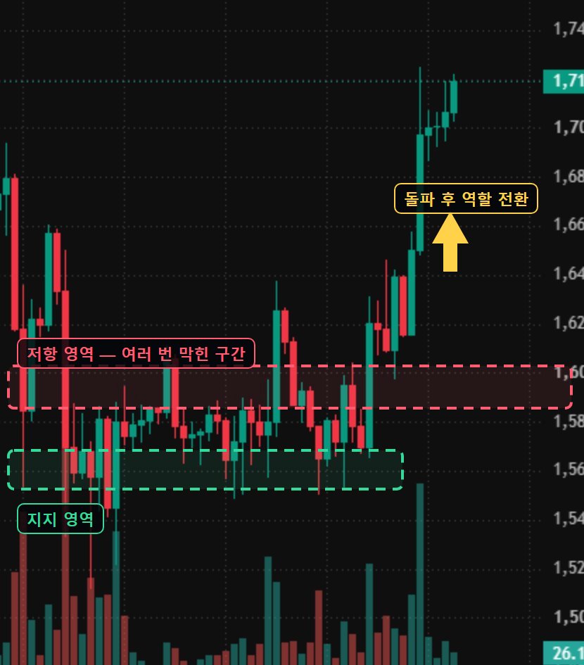
On a live chart, watch for three things. First, the reaction as price approaches the zone — shrinking upside progress and lengthening upper wicks are a record that the resistance's resting supply isn't being absorbed. Second, how price moves through the zone — a body-close breakout on heavy volume, or just a wick stab? Third, whether the old resistance actually acts as support on the post-breakout retest. A zone where these three scenes repeat is a supply zone that's still alive.
Now for an honest accounting of the limits. First, hindsight bias — on a chart that's already played out, every bounce has a line under it. But drawn in advance, there are always multiple candidates, and you only learn which zone did the work after the fact. Second, the levels everyone watches paradoxically become targets. Stop orders pile up just below the obvious support zone, and derivatives markets repeatedly print the move that stabs briefly into that cluster, fills it, and reverses — a structure dissected in the stop hunt guide. Third, against a strong trend or major news, a zone is tissue paper. Support is a probabilistic reaction point, not a defensive line.
A support zone is the start of a scenario, not a complete entry thesis. A position taken "because it's support," with no invalidation point (a close beyond the far side of the zone), becomes the on-ramp to averaging down when the zone fails — and on a leveraged account, a single zone breaking can lead straight to liquidation. The point of drawing zones is less about finding where to buy and more about deciding in advance where you'll admit you were wrong.
What Makes Crypto Futures Different — Liquidation Prices as Measured Supply Zones
If equity supply zones are built from break-even psychology and resting orders, crypto futures add one more axis: forced liquidation. A position at N× leverage gets its liquidation price roughly 1/N away from entry — so about 5% below a price area crowded with 20× longs, liquidation supply stacks up like a staircase. A stop order can be canceled the moment its owner changes their mind; a liquidation cannot. That makes liquidation clusters the hardest kind of resting-order mass there is — a supply zone whose existence is structurally locked in because it can't be canceled. The mechanics are covered in what is liquidation.
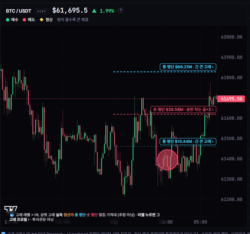
Conventional supply-zone analysis is an inference: "there should be orders here." But on venues where positions are public, like Hyperliquid, you can read top whales' actual average entries and liquidation prices directly. A band where multiple whales' liquidation prices overlap in a narrow range isn't a guess — it's a measured order-density price area, and Whale Story's whale levels overlay exactly that on the chart.
From here the path forks in two. For a tool that quantifies supply zones through the fill distribution at each price, continue to the volume profile guide. For an interpretive framework built around how smart money uses those levels, continue to SMC and order blocks. Either way, the starting point is the same — a zone, not a line; a map of orders, not a prophecy.
The weak point of support/resistance analysis is that it leans on the inference that orders "should" exist at a given price area — and on Whale Story, part of that inference can be replaced with measurement. The whale levels on the live tracker overlay the actual average entries and liquidation prices of Hyperliquid's top whales directly on the chart, and a band where multiple whales' liquidation prices overlap in a narrow range is a measured order-density price area, not a guess. In past observations, reactions have repeatedly appeared amplified when price approached these dense bands. As a reference for phases where a pumping coin fails to absorb overhead resistance, see the suspected-top signals; for smart-money wallets repeatedly accumulating or distributing at specific price areas, see the smart-money tracker. That said, these are tendencies in past data only — they guarantee neither a bounce at any particular zone nor any direction.
FAQ
Which timeframe should support and resistance be drawn on?
The higher timeframe sets the map. Draw the major zones on the daily first (add the weekly for swing trades), then use the 4-hour and 1-hour charts only to refine each zone's boundaries. Start from lower timeframes and you end up with dozens of lines, and the map stops functioning as one.
Does more touches always mean stronger support?
Touch count matters, but it isn't absolute. At equal touch counts, the more recent reaction better reflects current order density, and reactions that carried volume are the more trustworthy record. There's also a flip side: support that has been knocked on repeatedly means that much more stop-loss supply has piled up beneath it, and it has been observed that when such a level finally gives way after repeated touches, the drop can be sharper.
How should a broken support level be read?
A close below the zone's lower edge counts as a breakdown. Broken support flips roles and becomes a resistance candidate (the S/R flip), and the next thing to watch is whether the pullback gets rejected at that zone. A wick that stabs through and recovers is generally read not as a breakdown but as a record of the zone being defended.
Are supply zones and support/resistance different concepts?
At the core they're the same thing. A supply zone refers to the resting inventory — orders waiting to sell or buy — stacked at a given price area, and when that inventory stops price, it shows up as support or resistance. Volume profile is the tool that quantifies those zones by fill volume at each price, and in crypto futures, liquidation clusters add a supply zone you can actually measure.