Chart Timeframes — Higher for Direction, Lower for Timing
Published 2026.07.06
"Which timeframe should I watch?" is the first question everyone asks when learning to read charts — but it isn't a question without an answer, it's the wrong question altogether. Timeframes aren't something you pick one of; they're something you combine by assigning each a role. This guide explains the structure in which higher timeframes handle direction and context while lower timeframes handle timing, then walks through the three-step process of working down from the daily to the 4-hour to the 15-minute chart, in order. It also confronts head-on the self-justification trap that nearly every beginner falls into: switching timeframes to avoid taking a stop.
- Each timeframe simply compresses a different amount of time into one candle — it's all the same market. A daily uptrend and a 15-minute crash aren't a contradiction; they're a difference in scale.
- Higher timeframes (daily, 4-hour) handle trend direction and major price zones; lower timeframes (15-minute, 5-minute) handle refining entries and invalidation points. The order is always fixed: top down.
- Your invalidation must stay anchored to the timeframe the setup was designed on. The moment your stop level arrives and you switch to a higher timeframe to argue the trade is 'still alive,' analysis becomes an alibi for refusing to take the loss.
- Multi-timeframe analysis isn't a cure-all either. Higher-timeframe reads still involve judgment calls, and without rules for handling conflicting signals, it collapses back into discretionary trading.
Same Chart, Different Story — How Timeframes Change the Picture
On the daily chart you see a clean uptrend making higher highs and higher lows — then you open the 15-minute chart and price is dumping. That's not a contradiction. One daily candle contains 96 fifteen-minute candles compressed inside it, and a 15-minute crash can pass through the daily as nothing more than a lower wick on a single candle. A timeframe is just a lens that slices the same trade record at different scales. What a single candle actually records is covered in Candles and Volume.
That's why "which timeframe is the most accurate?" has no answer. No timeframe is more 'real' than any other. What differs is what each lens shows well. The wide lens shows the trend and the major price zones; the narrow lens shows the detailed battle unfolding inside those zones. What traders actually use isn't a single timeframe but a combination of timeframes with different roles.
Timeframes aren't a question of picking the right answer — they're a question of dividing up roles.
Division of Labor — Higher Timeframes Set Direction, Lower Timeframes Set Timing
The principle is simple. The higher timeframe sets direction and context — which way the trend is pointing, where the major support and resistance zones sit, and which phase of that structure price is currently in. The lower timeframe sets timing — whether price actually reacts when it reaches the zones marked on the higher timeframe, and how tightly you can narrow down entry candidates and invalidation points. Think of it like maps: the higher timeframe is the city map, the lower timeframe is the street map. Holding only the street map, you have no idea which city you're in.
There's a rule of thumb for spacing the combination. Higher to middle is roughly a 4–6x gap, and the gap from the middle to the lower execution screen is often wider still. Daily → 4-hour → 15-minute (6x, then 16x) and 4-hour → 1-hour → 5-minute (4x, then 12x) are the classic examples — and this variation, where only the execution leg gets the wider gap, is actually closer to the standard in practice. If the spacing is too tight (15-minute → 5-minute → 3-minute), the three screens are effectively the same picture and the combination is meaningless; too wide (weekly → 5-minute), and the intermediate context breaks, leaving no way to connect the higher-timeframe read to the lower one.
What looks like a clear downtrend on the 15-minute chart is often just a single pullback inside an uptrend on the 4-hour. Much of what looks like a 'trend reversal' on a lower timeframe is a perfectly normal wave within the higher-timeframe structure. That's why traders check what a lower-timeframe picture corresponds to on the higher timeframe before putting a name on it.
The Three-Step Process — Working Down from the Daily to the 15-Minute
The key is keeping the order fixed. You always work from higher to lower, in one direction only. The moment you like what you see on the lower timeframe and start climbing back up to rewrite the higher-timeframe verdict, the entire process falls apart.
- Daily — classify the structure. Classify the trend by whether the sequence of highs and lows is rising or falling, and mark the major support and resistance zones that have produced repeated reactions. The directional bias set here does not get overturned at the steps below.
- 4-hour — locate the price. Within the daily direction, see what price is doing right now. Is it pulling back? Consolidating? How far is it from the daily zone? This is where your 'place to wait' gets defined.
- 15-minute — watch for the trigger. When price reaches the marked zone, confirm the reaction on the lower timeframe — a reversal candle on volume, price defending the zone, and so on. This is the step where entry candidates and invalidation points get narrowed down precisely.
- Calculate invalidation and stop distance. Put a number on the point where 'if price crosses this, the scenario is wrong,' and work backward from that distance to the loss you can absorb.
- After entry, stick to the framework you designed. Management and invalidation calls are made on the timeframe the setup was designed on. If you designed it on the 15-minute, you judge whether it's wrong on the 15-minute.
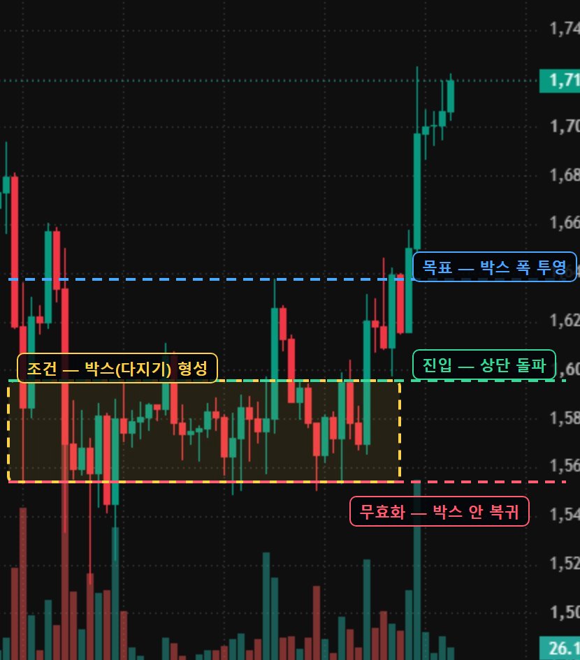
Here's what it looks like in numbers. Say the BTC daily is in an upward structure, and the 4-hour is pulling back toward a support zone at $68,000–68,600. You confirm a reaction at the zone on the 15-minute and set your entry candidate at 68,400 with invalidation at 67,800, below the bottom of the zone — that's a stop distance of about 0.9%. With the prior high of $70,200 as the first target, the target distance is about 2.6% — a structure with a risk-reward of roughly 1:3.
This is, of course, purely an example of how the math works, not a statement about future price paths. The point is that this calculation doesn't come from any single timeframe. The daily gave the direction, the 4-hour gave the location, and the 15-minute gave the precise numbers. Remove any one of the three screens and both the entry candidate and the invalidation point become baseless guesses. How to carry the resulting stop distance and target distance into position design is covered in Risk-Reward.
Combinations by Trading Style — Scalping, Swing, Position
Which three-step stack you use is determined by your holding period — in other words, your trading style. Scalping, which holds for minutes to hours, frames context on the 1-hour and 15-minute and executes on the 5-minute and 1-minute. Swing trading, which holds for days to weeks, anchors on the daily with the 4-hour and 1-hour as execution screens. Position trading and trend following, which run for weeks to months, center on the weekly and daily and barely look at lower timeframes at all. Either way, the skeleton is the same: one anchor screen plus one execution screen.
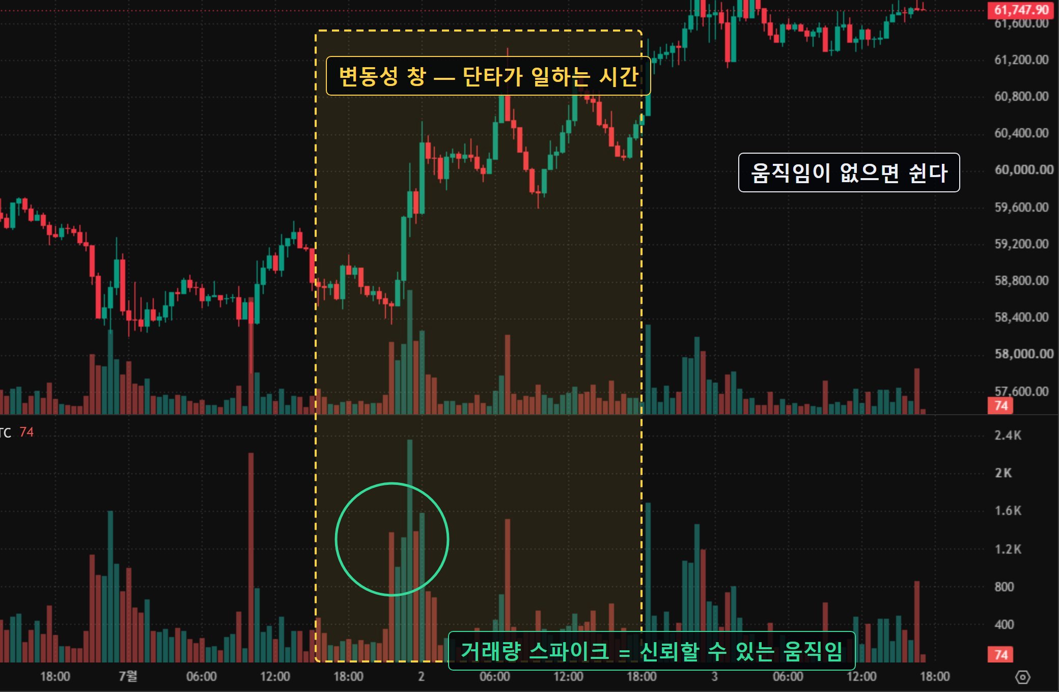
The shape of the risk changes with the style too. If a 15-minute setup has a 0.4% stop distance and a daily swing setup has a 6% stop distance, then under the same condition of risking 1% of the account, the position sizes differ by 15x. The lower the timeframe, the tighter the stop — which creates the temptation of big positions and high leverage. But by the same token, a single burst of noise can sweep your stop, and fees and slippage take up a bigger share of your P&L. Factor in that shorter screens mean higher trade frequency, which means losses can compound faster as well.
A 5-minute execution screen is a tool for someone who can sit in front of the chart all session. If you have a day job and can only check charts a couple of times a day, taking a 5-minute setup means holding a position you cannot manage. The right order is to first count the hours you can actually spend watching charts, then pick the timeframe that fits.
The Traps — Noise, and 'Switching Timeframes When You're Wrong'
The first trap is lower-timeframe noise. The lower you go, the more candles there are, and the number of shapes that look like patterns explodes accordingly. The 1-minute chart prints dozens of 'breakouts' and 'reversals' in a single day, but most of them are a few ticks of order-book jitter. As the number of signals grows, the reliability of each individual signal falls — which is exactly why watching a lower screen without higher-timeframe context is dangerous.
A setup designed on the 15-minute hits its invalidation point — and you open the 4-hour and delay the stop because "the bigger picture is still intact." Dressing up stop denial as analysis is the most common abuse of multi-timeframe analysis. Invalidation is anchored to the timeframe the setup was designed on. The abuse runs the other way too — wanting a position so badly that you drill down through timeframes hunting for a justification. Drill down far enough and a picture that looks like evidence for either direction will always appear.
The limits of multi-timeframe analysis itself deserve an honest look as well. Reading the trend on a higher timeframe is still a subjective exercise — different people anchor on different highs and lows — and unless you decide in advance which side wins when the higher and lower timeframes conflict, you end up back at case-by-case discretion. On a chart viewed in hindsight, 'price followed the daily direction' always looks correct, but that is after-the-fact tidying, not evidence of predictive power. What this tool gives you is organized perspective and enforced rules — not the right direction.
Whale Story Field Data — Which Time Horizon Do Whales Trade On?
Move the timeframe discussion into observed data and an interesting picture emerges. Looking at the positions of the top Hyperliquid whales Whale Story tracks, a large share of positions stay open for days to weeks after entry. It has been repeatedly observed that even several rounds of sharp 15-minute swings don't flip these positions' direction — circumstantial evidence that the screens these traders watch aren't minute charts. Hyperliquid is an exchange where positions are visible on a public ledger, which is what makes this kind of holding-period observation possible.
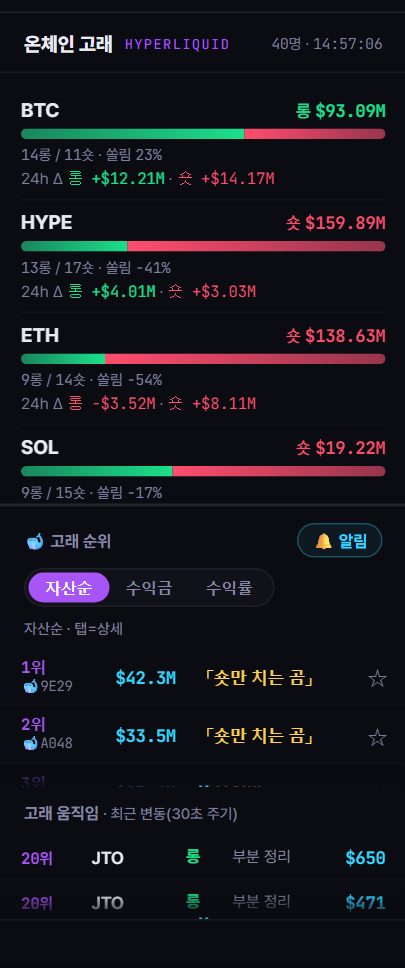
The opposite extreme shows up in the data too. The minute-by-minute trade surges and suspected-top signals on pumping coins are lower-timeframe events, while the accumulation and distribution of smart-money wallets plays out over weeks — a higher-timeframe event. Participants on different time horizons are moving in the same market at the same time — the 'different story on every timeframe' this guide describes, visible in the data.
A top whale's position open time and holding duration so far let you infer which time horizon that wallet operates on. Wallets that react to minute-level signals and wallets that build over weeks show fundamentally different behavior patterns. But this is observation, not grounds for imitation — importing the decisions of a participant with a different holding period into your own time horizon is walking your own alley with someone else's map.
The division of labor between timeframes can be verified with observed data on the Whale Story terminal. The whale rankings on the live tracker show the position open times and holding durations of top Hyperliquid whales as-is; in past observations, a large share of positions were held for days to weeks, and flipping direction on minute-level swings was rare — observed evidence of participants operating on higher timeframes. Conversely, the pump events picked up by the suspected-top signals are minute-level, lower-timeframe events, while the accumulation and distribution of verified wallets logged by the smart-money tracker plays out over weeks. The data shows participants on different time horizons moving in the same market at the same time. Note that these are tendencies from past observation only and guarantee no edge for any particular time horizon or direction.
FAQ
Which timeframe should a beginner start with?
The common recommendation is to start with the daily and 4-hour charts. Higher timeframes have fewer candles and less noise, making them well suited to practicing structure — highs and lows, support and resistance. The safer sequence is to add lower timeframes as a timing tool only after you've developed an eye for reading context on the higher ones.
What do I do when the higher and lower timeframes point in different directions?
The general principle is that the higher timeframe wins. A counter-move on the lower timeframe is usually interpreted as a pullback within the higher-timeframe structure. That said, reversals that start on the lower timeframe do sometimes genuinely break the higher structure — so the way to handle the conflict is to decide in advance which level on the higher timeframe, if broken, changes your view.
How many timeframes should I watch?
The consensus is that three is enough — one each for direction (higher), location (middle), and timing (lower). Adding more screens adds conflict, not information, and since at least one of them will always show you the picture you want to see, it mostly just supplies raw material for self-justification.
Can't I just trade off the 15-minute chart alone?
Then you have a timing screen with no context screen. Whether a 15-minute move that looks like a reversal appeared right in front of major daily resistance or in the middle of nowhere changes its meaning completely — and the 15-minute chart alone can't tell you which it is. At minimum, add a step that checks context on one higher-timeframe screen.